
Charm in each and every curve
Polished
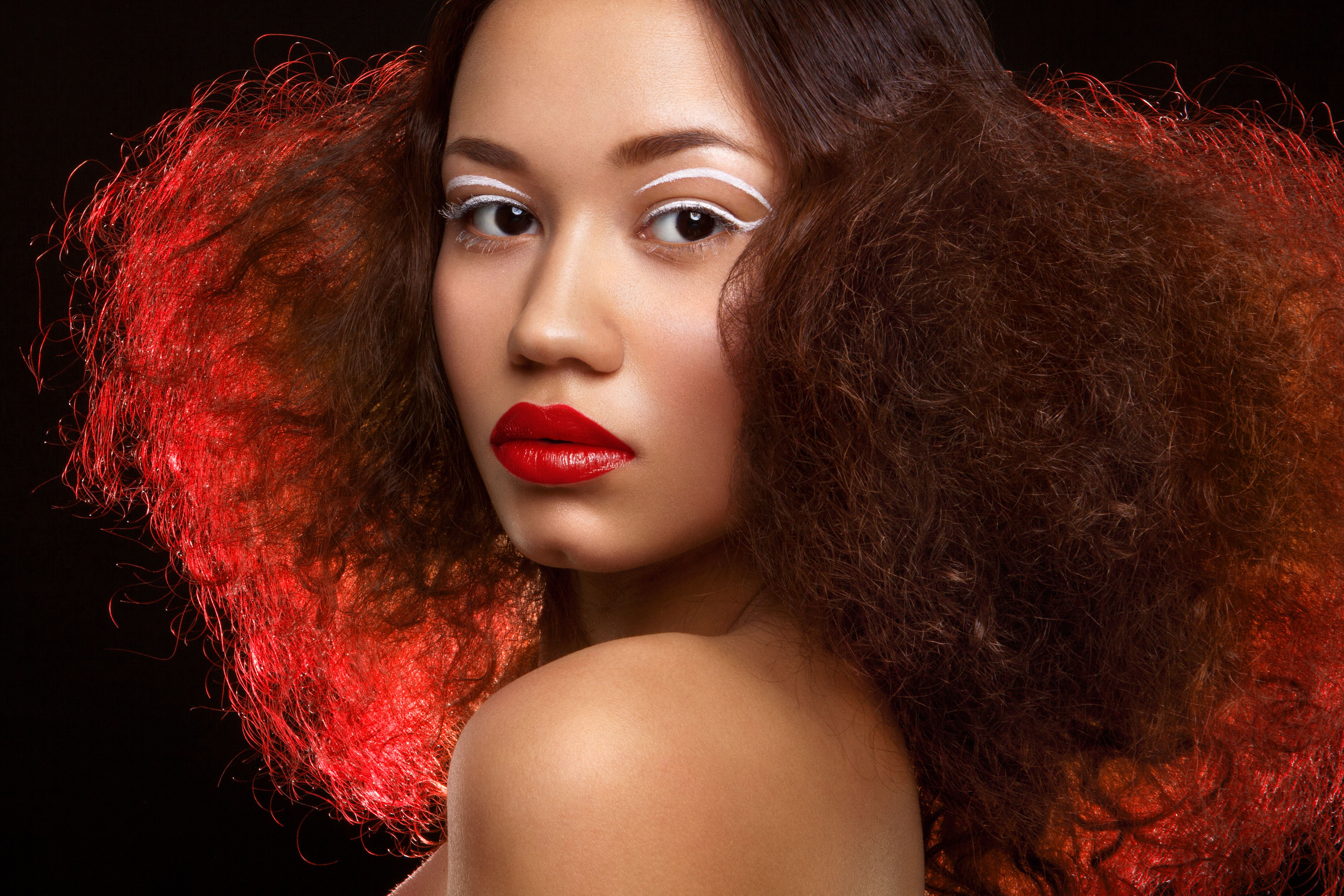
The identity emphasizes the value of the “Polished” brand on their customer’s charm and beauty by matching the beauty of women’s curves (hair, eyebrows, skin, mouth..). “Polished” logo is a written handwritten signature using a brush texture, which shows passion, and colored with a red color which shows charm and confidence.
Polished visual language and packaging connect with the master brand with a minimal yet powerful look, communicating passion and confidence. Along with the signature Polished red, the packaging and communication look and feel combine color, texture, and layout. In their work, our designers have looked for ways to introduce the wordmark as a graphical element to expand the brand’s visual language and make it more flexible and experimental.


