
Crafting the Misk Art Week Website
Misk Art Institute
Every year, Misk Art Institute hosts a week-long event with a variety of activities from talks and panel discussions to exhibits, performances and education sessions. This year was no different, and for it, they asked us to create a new website to act as a hub for all the information, and a portal through which users can register for the variety of happenings that week.
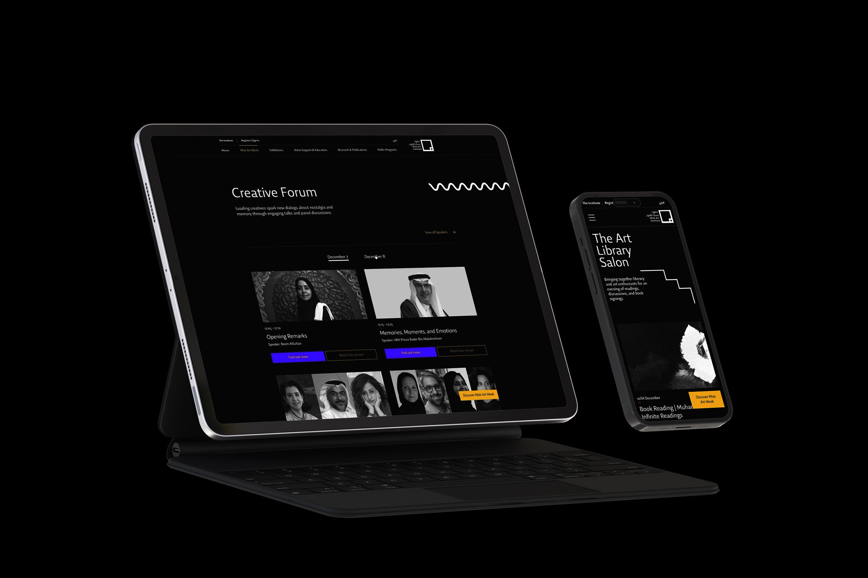
The concept was to create a space within their current website that felt like its own site, taking a different approach to their branding but keeping it consistent and familiar with the general feel in the rest of the pages. After being given instructions to create a non-scroll landing page, and the limitations of working within their existing grid structure, top navigation and footer.
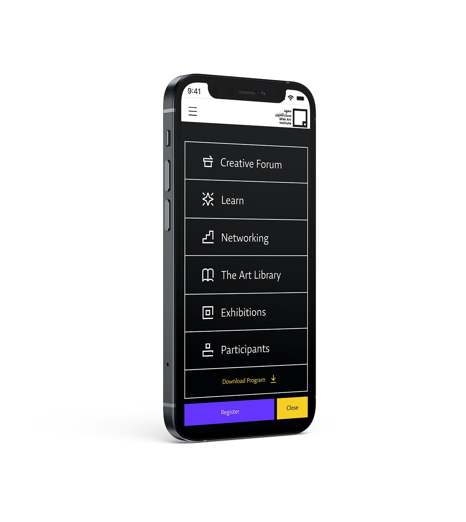
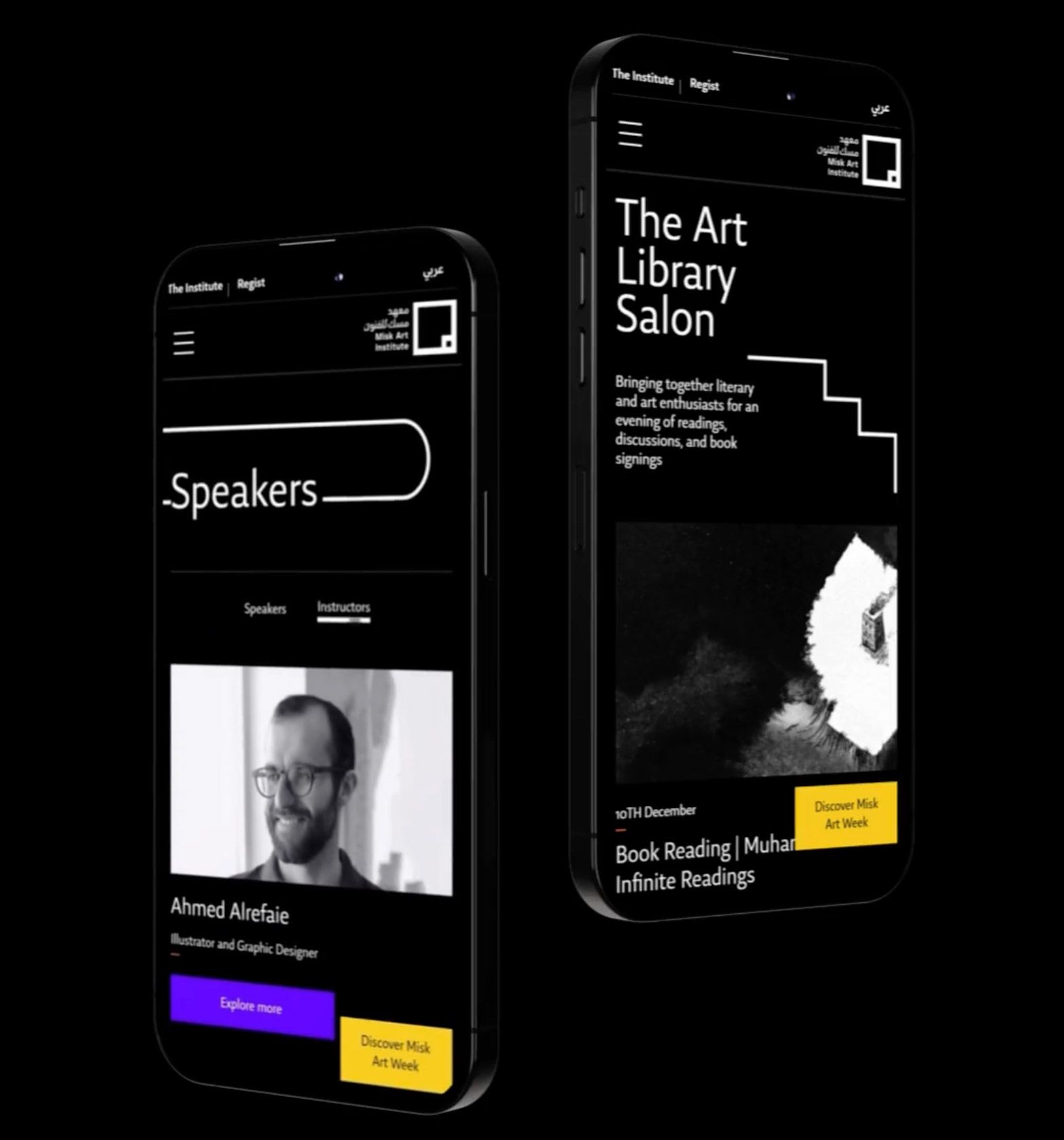
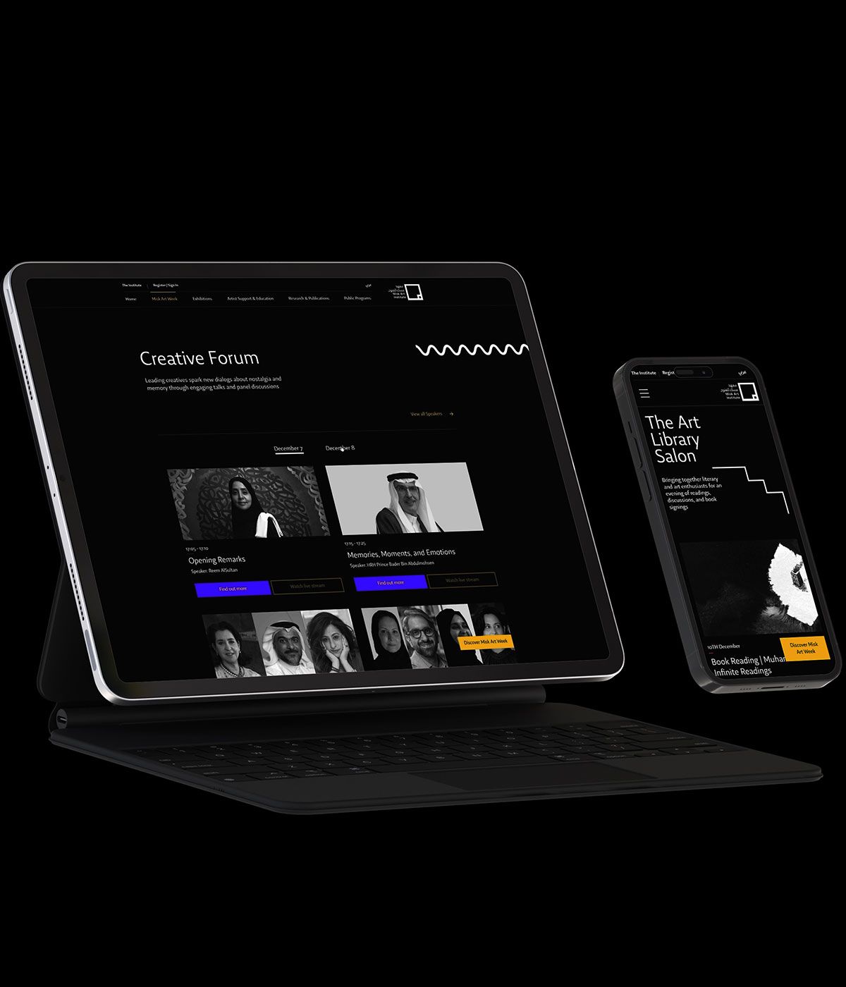
We tackled the layout and design of this website mobile first, identifying the necessary content flow for the user to complete the various tasks at different stages of their journey. Firstly, in order to establish a clear distinction from the rest of the website, we decided on a look and feel that inverted their colors, using white, purple and yellow over a black background. Additionally, instead of extending their main menu to show the internal tabs, we created a static hovering menu for easy navigation and access to the registration form.
We also wanted to re-imagine the use of their shapes on the page, so we injected them primarily as little animated details at the headers and as separators. So we chose a few of them and created SVG animations to ensure they remained responsive. We also used their custom Art Week icons in the custom sticky menu to reinforce them as visual cues.
The Outcome
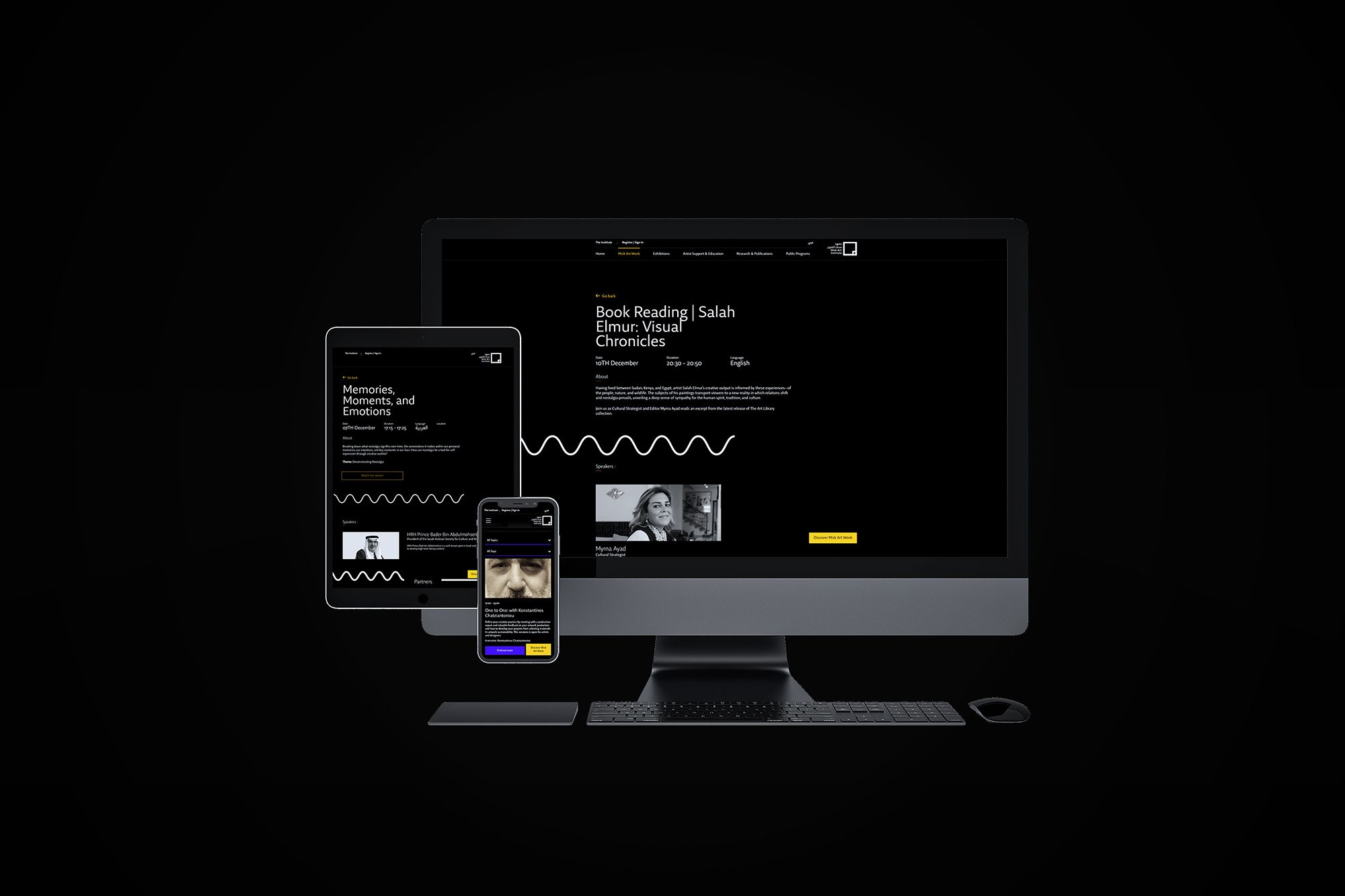
For the home page, we decided to storyboard and animate a quick video that showed all the key information from the first impression of the site. The rest of the pages use a clear and simple grid structure that enables the user to view and filter through the different available activities with ease.
The final outcome was also adapted for mobile, in both English and Arabic
