Siwar E-Commerce Platform
Siwar
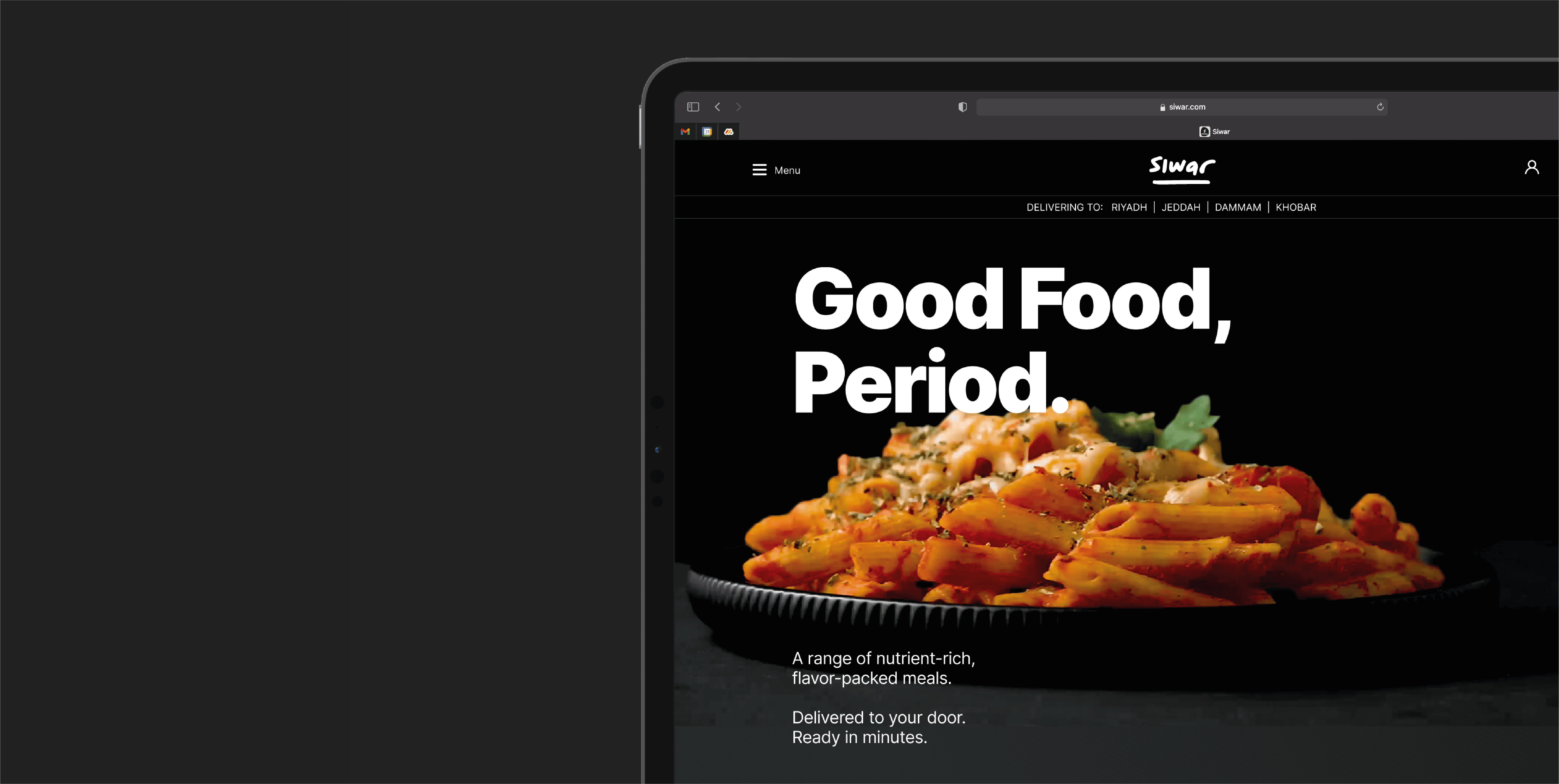
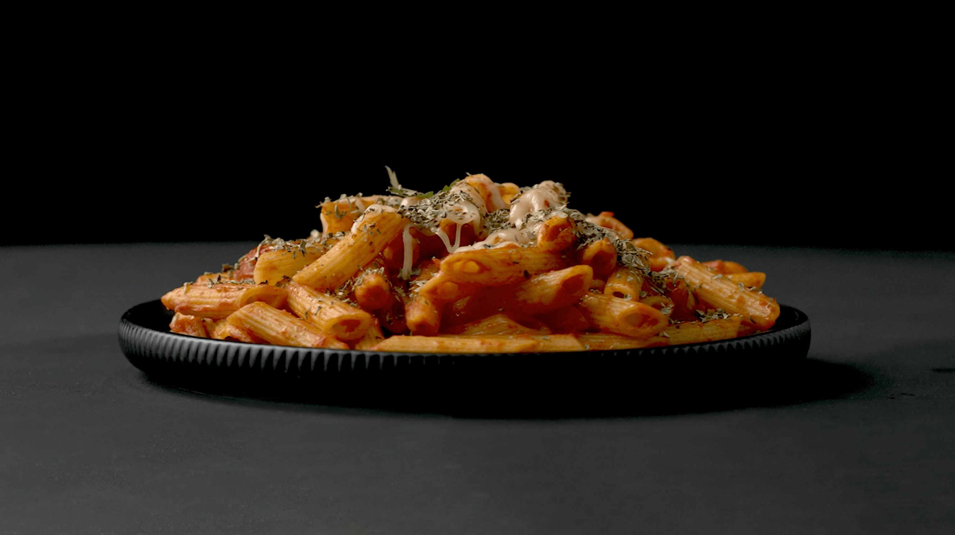
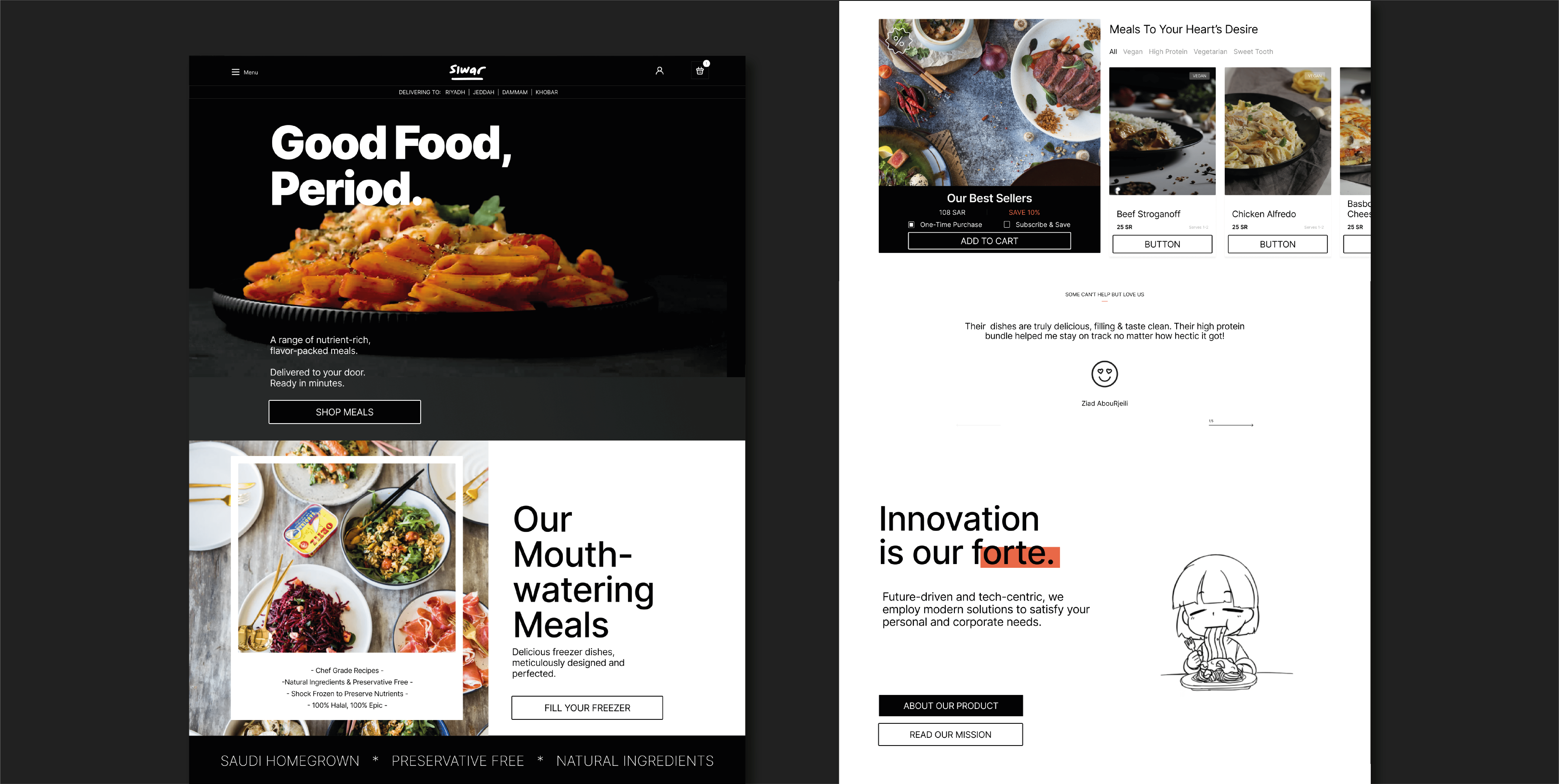
The website, from content to experience, was designed for optimal customer acquisition. We started by optimizing the content, basing our decisions on benchmarks in the food industry, we crafted a brand angle while finding the brand’s tonality along the way. We needed to not only highlight the product benefits and unique selling points, but also be confident in the way we say it. Witty words and mouth watering images of the freshly made dishes were key here: It's true what they say, you eat with your eyes first.

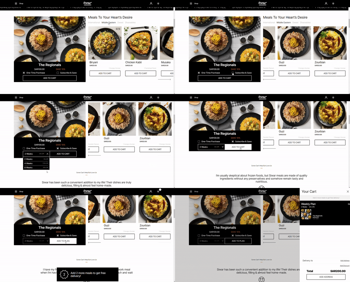
The first version of the Siwar site created two independent purchasing routes: shop & weekly plans were separate tabs, which created a system that didn’t necessarily encourage one over the other. It was important for us to create a more cohesive e-commerce experience by removing all barriers, and driving users to subscribe to the service. We did this by emphasizing the minimum order for free shipping, and potential savings via subscription, and most importantly, by incorporating the subscription option into the user flow, encouraging “custom bundling” options when users hit a number of items in their cart.
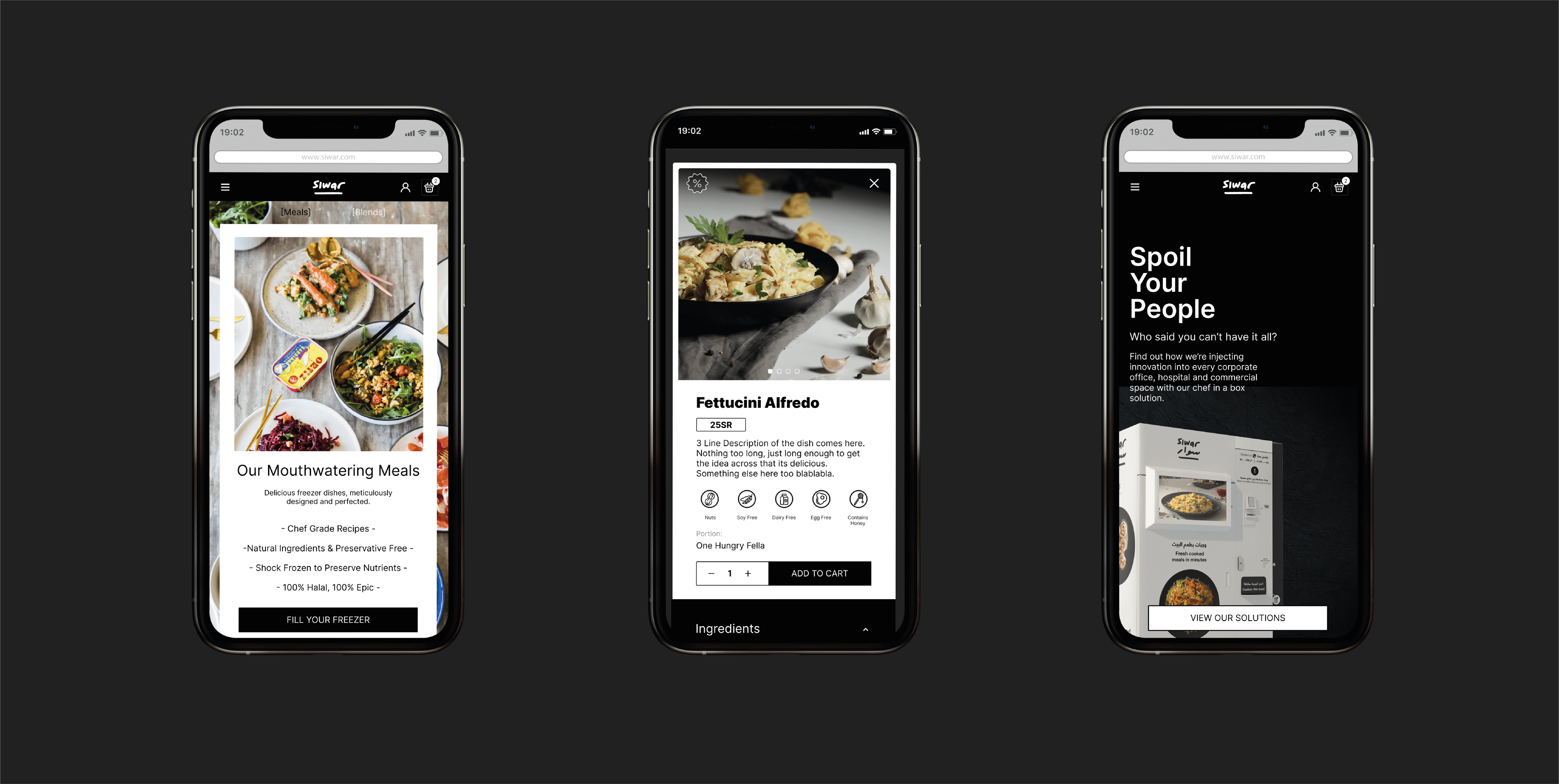
From the website, we drove people to download the app via download links & QR codes, and a free meal which in turn worked to increase acquisition, while the mobile app was mostly designed to maximize customer retention. Through push notifications, and customized emails, our goal moved on to establish customer relationships & loyalty.

The result is a simple website that emphasizes a simple and straightforward user flow. Analytics show an increase in brand visibility due to improved SEO, thanks to the content uplift and restructuring. Finally, the joint purchasing model displayed an increase in users opting for weekly subscriptions instead of single purchases.


