Where news beet!
beeto

After exploring the platform’s main features and comparing them with the most common social media platforms, we ended up defining beeto’s brand character before starting with the rebranding exercise.
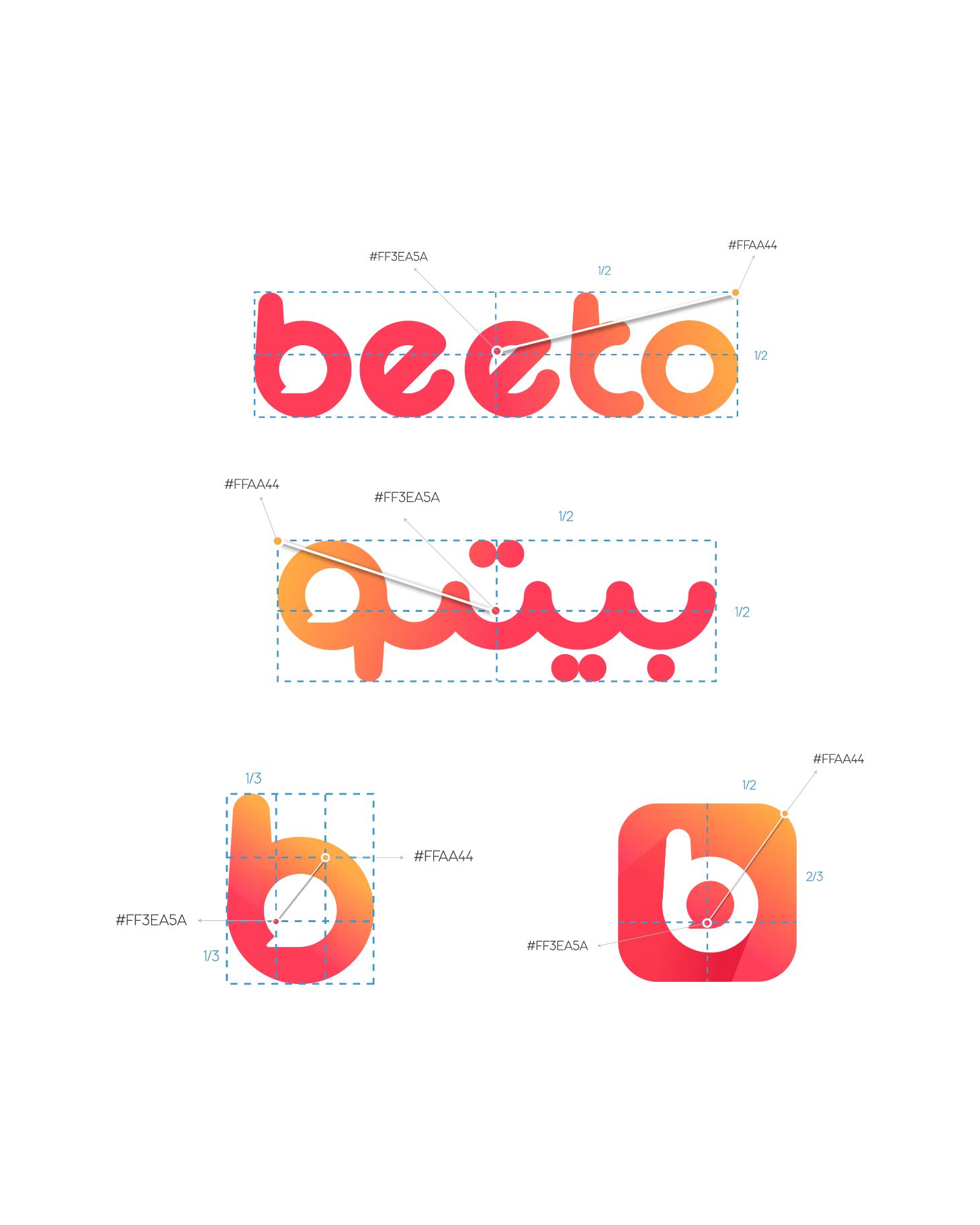
When working on the rebranding, we wanted to create a visual solution that eliminates that repetiveness of beeto’s speech bubble and preserves the friendliness of the brand’s character, so we created a circular logo where the “b” became an icon that holds the speech bubble icon.
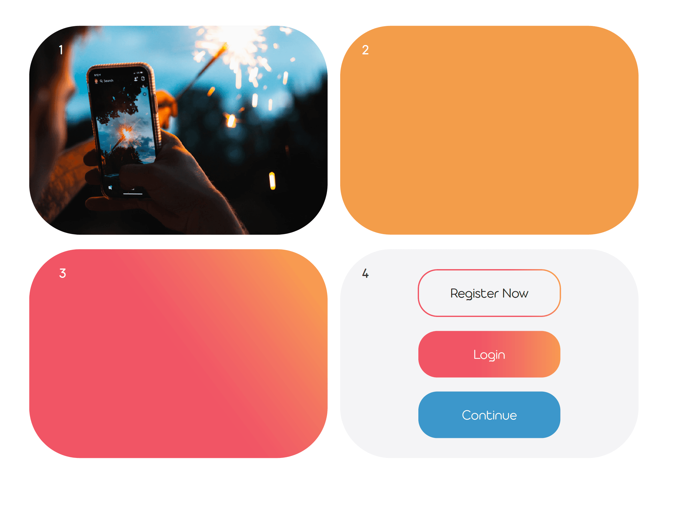
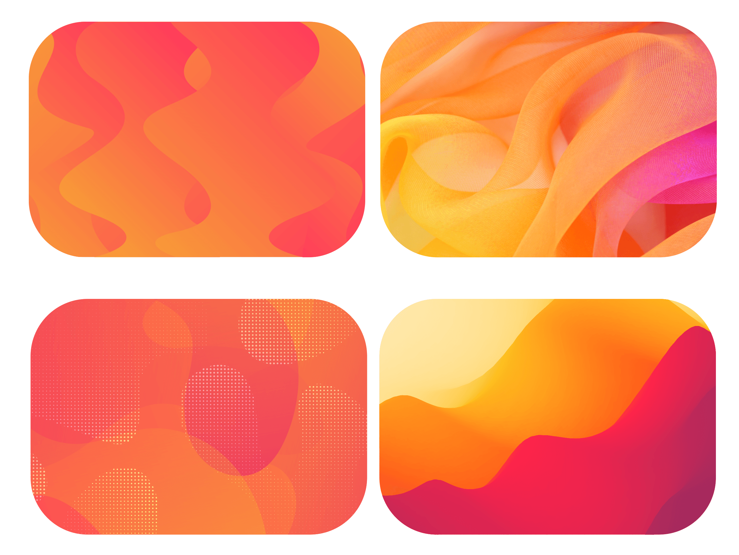
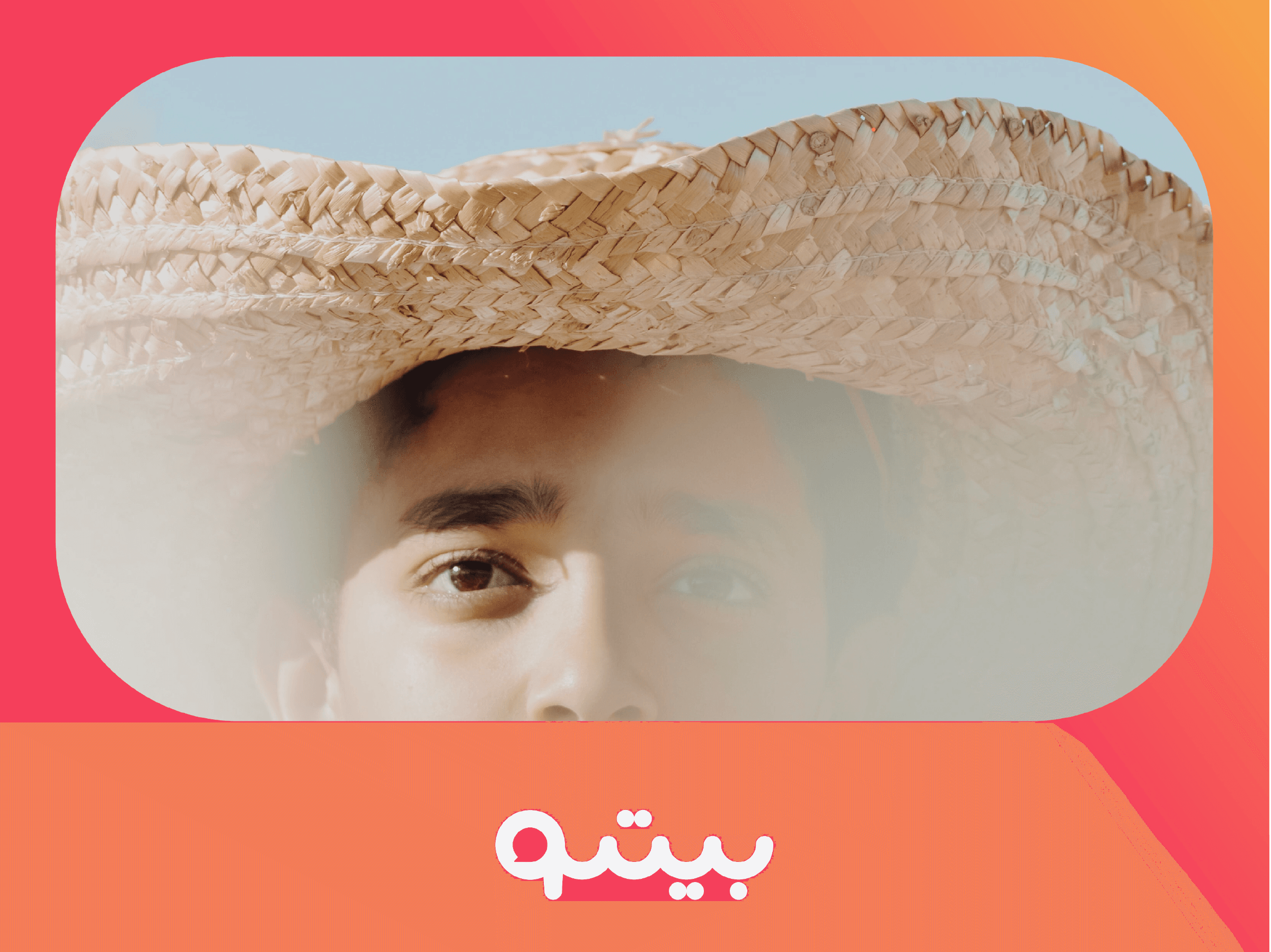
Sunset is beeto’s primary color. It can be used in branding and communication instances as well. It should be used in more expressive moments, such as applying it to typography, call-to-action buttons, and iconography.

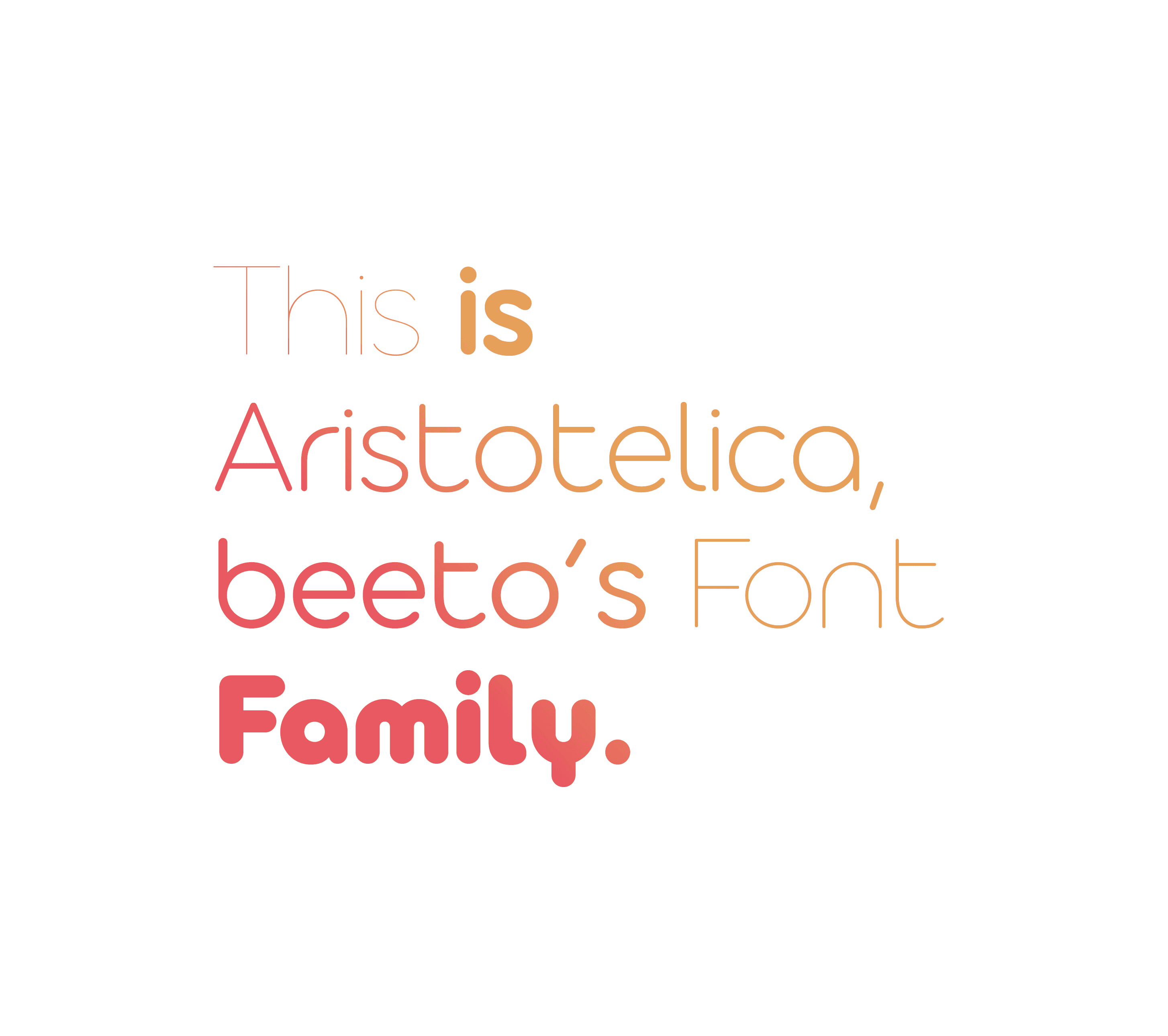
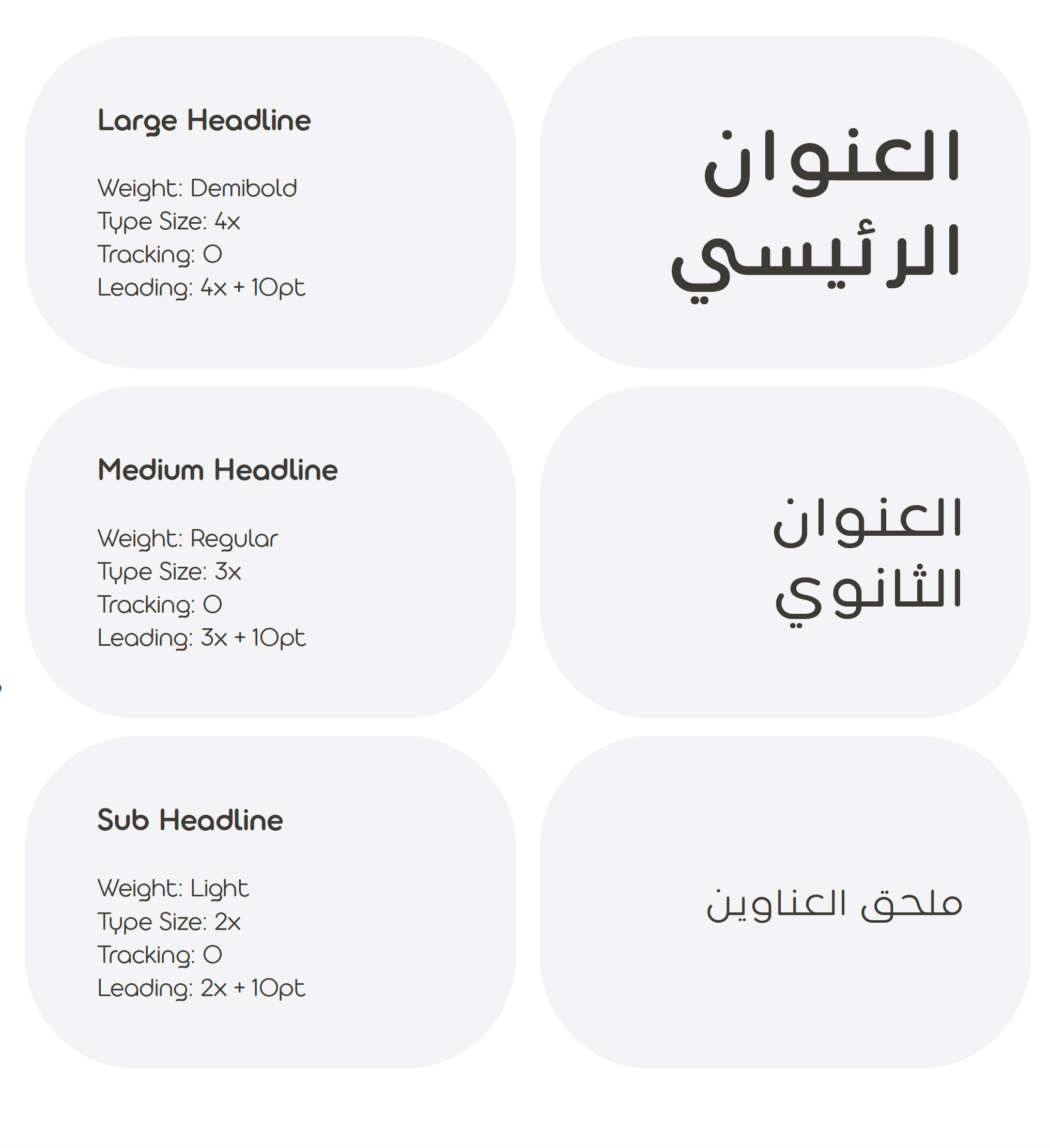
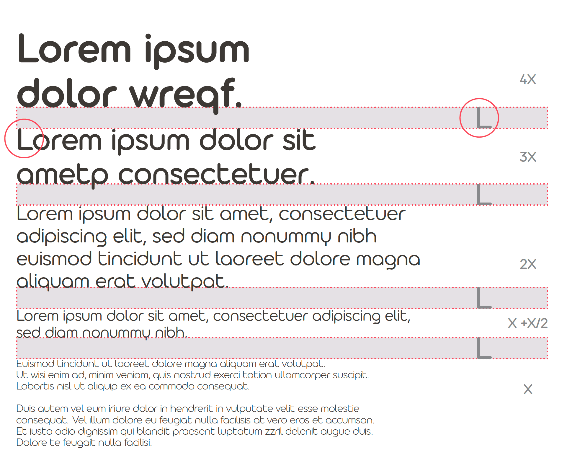
Typeface
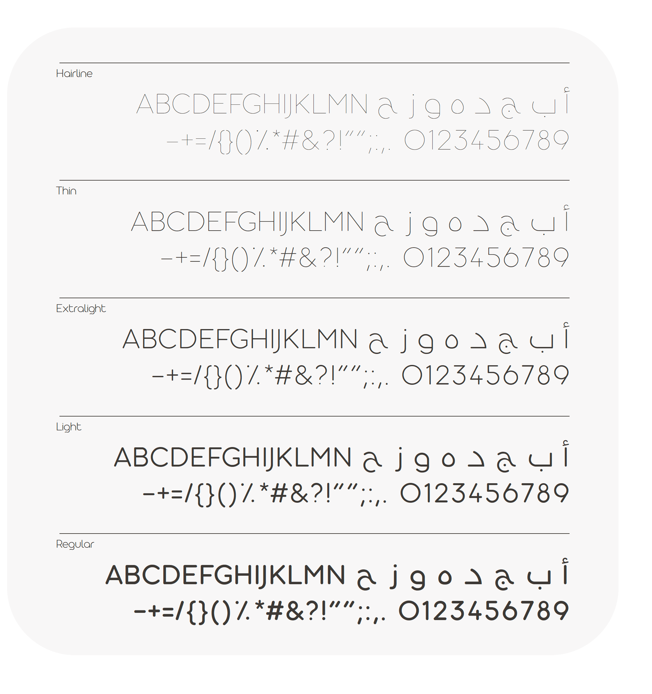
Aristotelica Pro is the typeface used in beeto’s brand identity and communication. It is used for all headlines and body copy. The weights used in beeto’s identity include hairline, thin, extralight, light, regular, demi-bold, bold, heavy and fat.
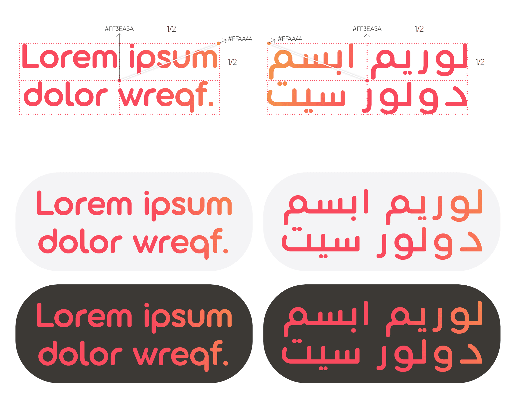
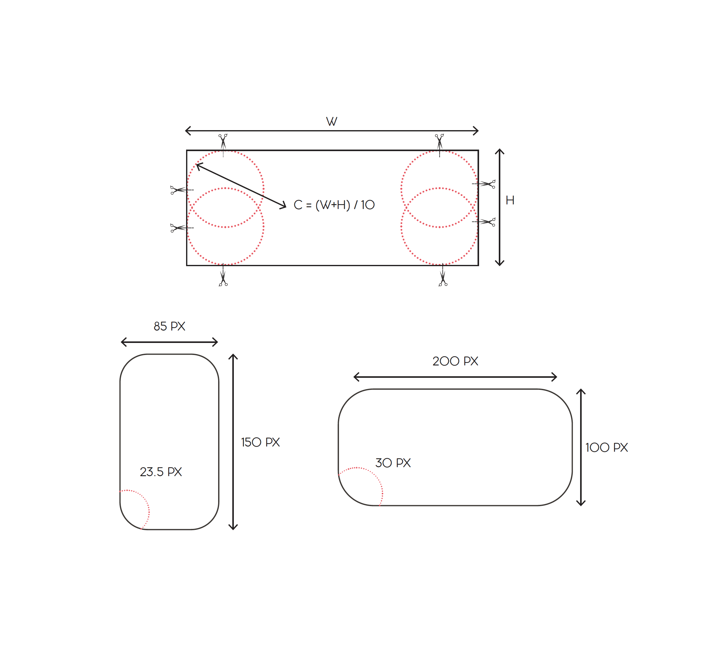
Rounded Rectangles Rounded rectangles are beeto’s primary shapes. They can be used for communication and corporate usage. Sharp angles aren’t preferable because they don’t match our brand character. The corner size is always related to the shape size.